I had the mode755.com domain name for decades to host my consulting business, and to supplement my resume as a sort of portfolio. However, as I moved into management consulting, the site no longer served me and sat idle for a decade. By 2019 it was an embarrassment. I wanted to update it to bring it up to modern web standards, and budgeted a couple weeks to update the CSS and copy, but where to start, and how to update it without too much effort? Here are the main decisions that I made during the process:
- No frameworks
- Mobile first responsive design
- Use downloadable fonts everywhere
- Use proper GIT source control
Frameworks
There are literally hundreds of CSS frameworks out there. A quick google search will reveal hundreds of articles on the top 10 or 20 CSS frameworks to leverage in 2020 and ooze praise on why each one offers so much benefit. It is so ingrained that using a modern CSS framework is best practice that it often comes up as a job interview question. However, I barely considered using one. Here’s why:
- The last time I updated this site was a decade ago. It’s a safe assumption that I won’t be updating the layout again for many years to come. 5 years from now, do I want to be updating pure CSS? or a CSS library that was in vogue 5 years ago?
- I don’t have any needs that require a framework. All I want is the site to look good at different resolutions, easy to accomplish in vanilla CSS.
- I don’t want a framework dictating any design. I already know what design I want. If I need a component, I can grab sample code from any site that does what I need and modify it to my needs.
- CSS has come a long way in the past few years. New features of CSS 3 do most of what I would have required a framework to do just a few years ago. Media queries and downloadable fonts solve all of my design issues today.
- Browsers have come a long way as well. I don’t believe that I need a framework to smooth over browser inconsistencies the way that was necessary a few years ago, especially for a simple website. When I tested my site on a multitude of browsers, I found few surprises.
- Simplicity. It’s easier to code and debug without a framework getting in the way. I believe it is faster to learn and code vanilla CSS than to learn and code in a new framework every year.
- Bloat. There is no code that I did not write myself: no libraries to load, no JavaScript, no extraneous classes, no compile process. I can optimize as much as I need to, meaning faster page loads.
- People get religious about frameworks. I find it much easier to justify to myself and to others why I used no framework than why I used a certain framework. Sometimes no opinion is the best opinion!
The only thing that bothers me about this choice is the amount of repetition of code in my CSS. It bothers me almost enough to want to use a preprocessor like LESS or SASS but not quite enough to actually use one. Perhaps by the time I come back to rewriting this site again, there will be some native CSS support for variables. That would make be very happy.
Responsive Design
As the majority of end users surf the web on mobile devices, I decided to design for mobile first, setting the chrome inspector to a 375×812 view-port to simulate an iPhone X as I worked. I’d write CSS for that resolution first, making sure that the site behaved correctly on both touch and non-touch devices, then spent time scaling up, not down. I was lucky to have the following physical devices on hand as I was testing:.
- iPhone X: 1125×2436 (375×812 effective) touch screen
- iPhone 6: 750×1334 (375×667 effective) touch screen
- iMac Pro’s built in Retina display 5120×2880: (2560×1440 effective)
- Secondary apple Thunderbolt display: 2560×1440
Where I didn’t have a physical device, I used Browser Stack, particularly to simulate Edge on Windows 10 and Samsung Galaxy 9 as my reference android device.
Media Queries
Can I just say that media queries are amazing? There is a massive amount of documentation on how to use them, so I won’t go into detail here, but I was able to accomplish the following with extreme ease:
- When the screen is less than 1200 px wide, the menu bar collapses into a drop-down
- When the screen is less than 430 px wide, I introduce the “hamburger” icon for the menu
- When the screen size is greater than 1800px wide, I oversize the logo and navbar and make sure that the text fills more space than just a thin bar in the center of the screen
- For the “contact me” bar that floats on the site, I use long text, abbreviated text, or oversized icons depending on the screen resolution, and move it around as needed
SVG
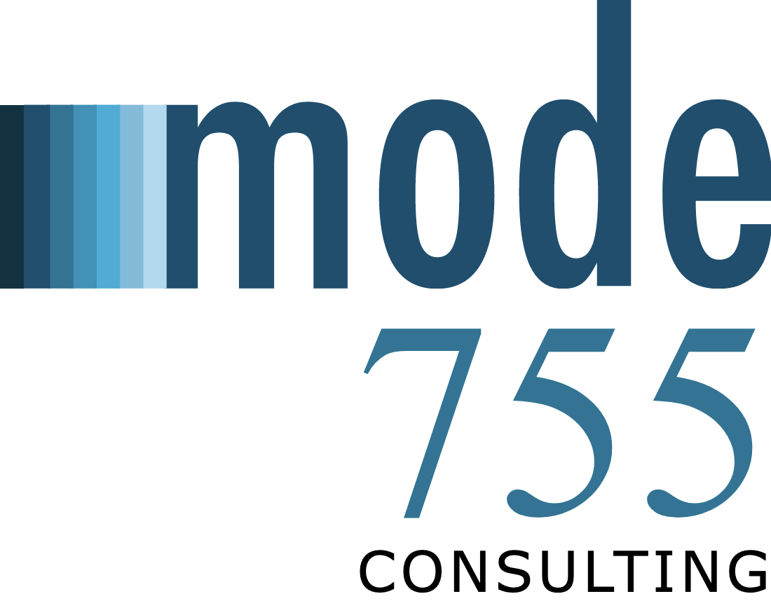
I had some difficultly designing the logo to be fully scalable using just web fonts and CSS boxes, so I gave up and converted part of it to an SVG, and that solved my problems. The source SVG is here https://www.mode755.com/images/logo.svg.
Downloadable fonts
One thing that is important to me is that the font is correct on all devices. Taking typography courses early in my career has ruined me for using stock fonts. I used to spend a fair amount of time designing the navigational elements in Adobe Illustrator and then creating images for the navigation that looked stylish. The body text of the site was always a jarring contrast with the elegance of the fonts I had used in more important areas of the site. Now with downloadable fonts, I can finally use the font I want everywhere with little hassle and the result is much more pleasing to the eye.
In the end I used Futura Condensed Medium as my primary site font. Futura was designed by Paul Renner in 1927, and the Condensed version was released in 1930. As a classic Bauhaus style font, it has been used by some of my favourite corporate images, including IKEA and Volkswagen, and was the primary influence on the enduring TTC font. I also use Didot for a single word in my logo.
    @font-face {
    font-family: 'FuturaCondensedMedium';
    src: url('//static.mode755.com/fonts/Futura-Condensed-Medium.woff2') format('woff2');
    src: url('//static.mode755.com/fonts/Futura-Condensed-Medium.ttf') format('truetype');
    src: url('//static.mode755.com/fonts/Futura-Condensed-Medium.eot') format('embedded-opentype');
    }
Github & AWS Code Pipleline
One of the challenges I had when doing this re-write is that I was using a webhosting service that required me to upload the files via FTP to a server somewhere. Ten years ago, I used a tool that had FTP built in, and this was perfectly adequate at the time. Today, I no longer want to use this tool, external FTP tools are a pain, and mounting an FTP endpoint as a local drive on mac proved unstable. Additionally, it proved challenging to configure my webhost to use secure FTP and I was uncomfortable leaving insecure port 21 open.
I decided to move my site to a private GitHub repro, and use AWS Code Pipeline to listen for git commits and pull the latest code to an S3 bucket. Some quick configuration of AWS Route 53 DNS, AWS CloudFront CDN and AWS Certificate Manager, and I had an extremely efficient method to update my site quickly and have it deployed to a global CDN. I may write more on this process later, as it was a very positive experience.
Analytics
No site would be complete without analytics, so I quickly added Google Analytics to the site, and created a few extra custom events for when people jump to my LinkedIn, Instagram, or call me from the site. A few minutes of extra effort has provided me with tonnes of insight on how people interact with my site, and areas for further improvement.
Summary
Every project, no matter how small, including this one, involves some learnings. I think it’s good practice, even when working alone on a personal project, to write up your experience so that you can summarize and solidify your experience. I’m not saying that I what I learned here will apply to all future projects, especially what I said about frameworks, but I will certainly recommend using source control on all future web projects, even small static websites. It is easy to set up and I’m sure it will make my next iteration of this site easier to approach no matter what tools I use.
For future reference, I’ll keep the old site alive here: http://2010.mode755.com/